moOz

Introduction
We are living in the age of the digital revolution. Our life is full of gadgets that constantly turn our attention away when we are idle. We tap our smartphones all the time for various purposes such as messaging, browsing on social media, or when we look for someone to ask out on a date. There are plenty of benefits of these technologies, however they can cause deterioration in our social life if we are hooked on them – which is not that difficult given their nature.
Let’s face it: Nowadays it is more difficult to establish social relationships offline – especially over a curtain age.
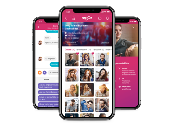
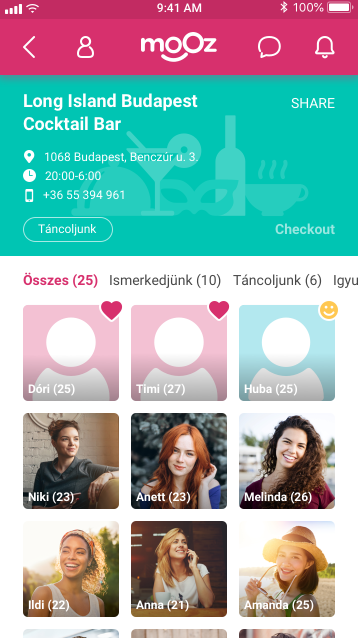
Mooz is a mobile application which was mainly designed to help people start a conversation with strangers at places such as pubs, nightclubs, or libraries.
I worked on the project at an agency called Pocket Solutions in Budapest.
The team that delivered the project was assembled by the fallowing competences:
- UX Designers (4 people, me included)
- Mobile developers (4 people)
- Mooz’s marketing manager and CEO (They were fully involved)
Initial steps
When our client turned to us with the idea, they wanted to validate their assumptions first.
Their main hypothesis was that many people often feel awkward when they try to talk to strangers.
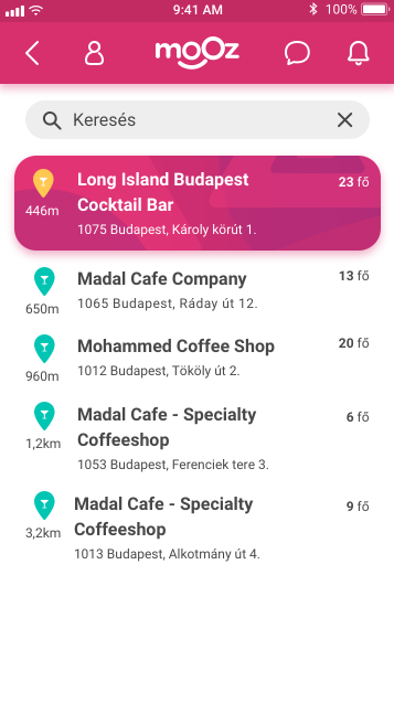
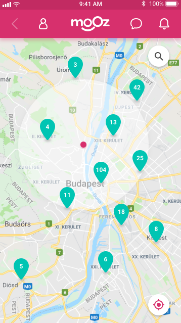
On the another hand, applications like Tinder or Happn seem to be ineffective when we are standing at the bar and we see someone who we want to approach. The owners of Mooz dreamed to implement a real time match making experience, where people could check into places and see other people’s profiles who are in that same place too.
Our design team was a great advocate of Design Sprint by Jake Knapp which we introduced to Mooz’s stakeholders as a highly organised way of idea validation. They took our advice.
Design sprint
At the beginning of that week we assigned the decision maker’s role to the CEO of Mooz. He had the right to make changes on any part of the concept at any time. One of my colleagues was the sprint facilitator, and the rest of us as were contributing as experts of our own areas.
We thought that the most important user journey to test would be when someone goes to a place, checks in, and starts to react on other people’s profiles.
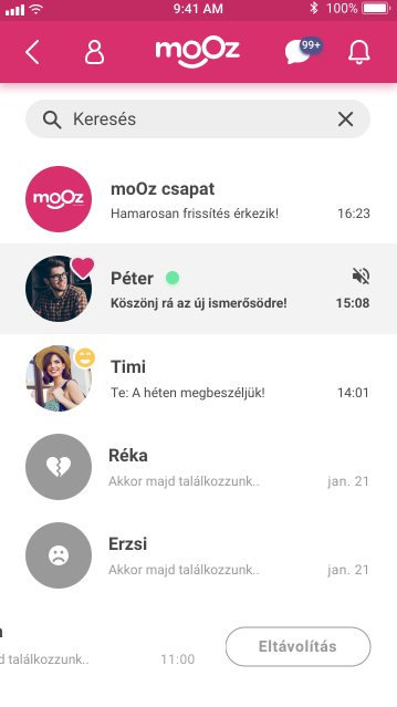
Compared to Tinder, in Mooz you must be at the physical location to be able to check in, and only after that can you see others’ profiles. You can then express your interest towards someone by marking them by a “like” or “friend” button. The core distinction between the two is that “friending” is more about when you want to grab a few beers with someone as opposed to the “like” gesture which means you are into the other person. The rest is classic match making. If both of you “like” or “friend” each other back, the two of you can talk via chat.
During the sprint we managed to be highly prolific. The dot voting system seemed to be very effective when we were sorting our drafts, and we could easily stick ourselves to those timeframes that were defined in the Sprint’s guide.
By the end of that week we had created a fully functional prototype of the above mentioned user journey, and we luckily could carry out our usability tests at the Budapest Party Boat. We got a lot of overwhelmingly favourable feedback on the concept.

Key findings
We conducted eight usability tests. We invited people to test our prototype as an exchange for a drink. The interviews hadn’t been done by one person, we were rotating the interviewer’s role among the members of our UX team.
When we assessed our test results, our findings were the following:
- If someone doesn’t check into a place, they will not be able to see other’s profiles. If they are not close enough to a place, they can not check in. So they must be there to be able to see other’s profiles, which made people feel safe.
- Our interviewees thought that it would be more fun to meet with someone right after they matched than stay online.
- Mooz is not only a dating app. People can make any kind of relationships by it.
- People felt worried about that when the app is released not many people would use it until it reaches a critical mass, therefore people would see lots of empty places when they checked in, that can results in massive uninstalls. However Mooz’s marketing team was familiar with this issue and they worked on a strategy to handle user retention.
MVP
By the end of the Sprint we had enough data from our qualitative research to set up the limits of a minimum viable product – Mooz’s CEO decided not to shoot the project down due to the Sprint’s success.
We created a process map to represent curtain flows and transitions between screens.
It was far more detailed and comprehensive than the journey map we created throughout the Sprint. When we have finished with that we prioritised the newly added features. When our design team and Mooz’s stakeholders both agreed on what the MVP should be we sketched down our ideas.
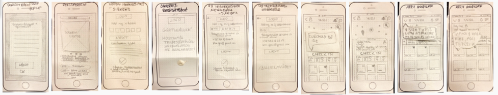
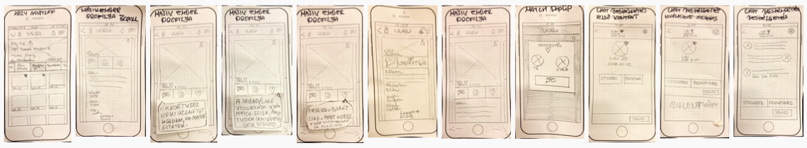
Paper Prototyping
We drew down every possible screen variations on paper. We had taken photos of our sketches, and created a paper prototype in InVision to test our concept a bit more. It was rapid, lightweight, and effective.

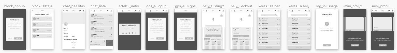
Wireframing
When we had validated our drafts, I created the digital wireframes out of them in Sketch.
I made a clickable low fidelity prototype according to our blueprint in a few days. Not so far from that time I left the company, so I couldn’t work on the hi-fi version of the interface. However my ex-colleagues did an excellent job making a vibrant and fully branded interface for the application.


HI-FI


Release
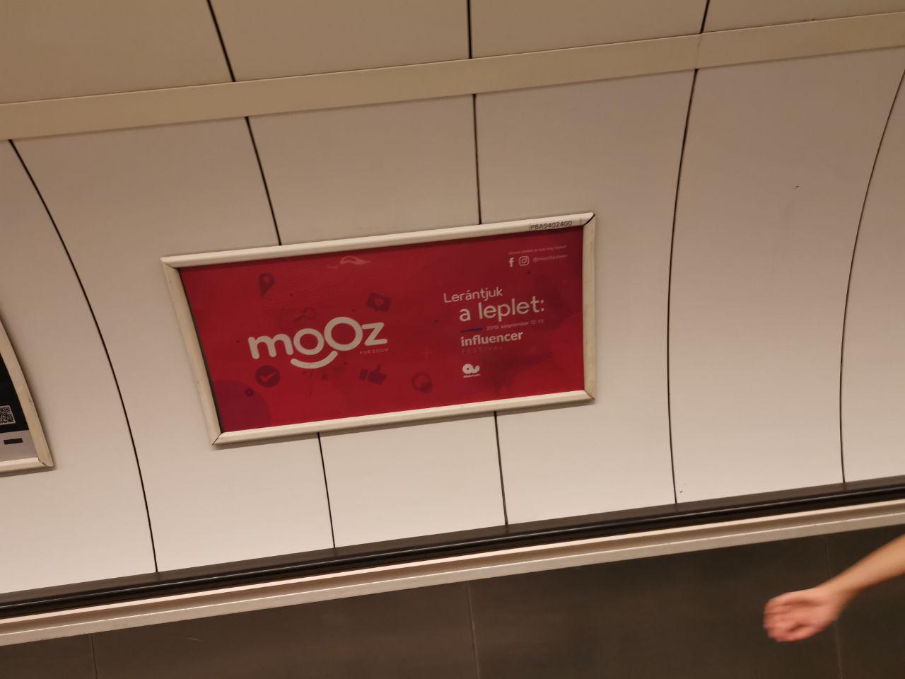
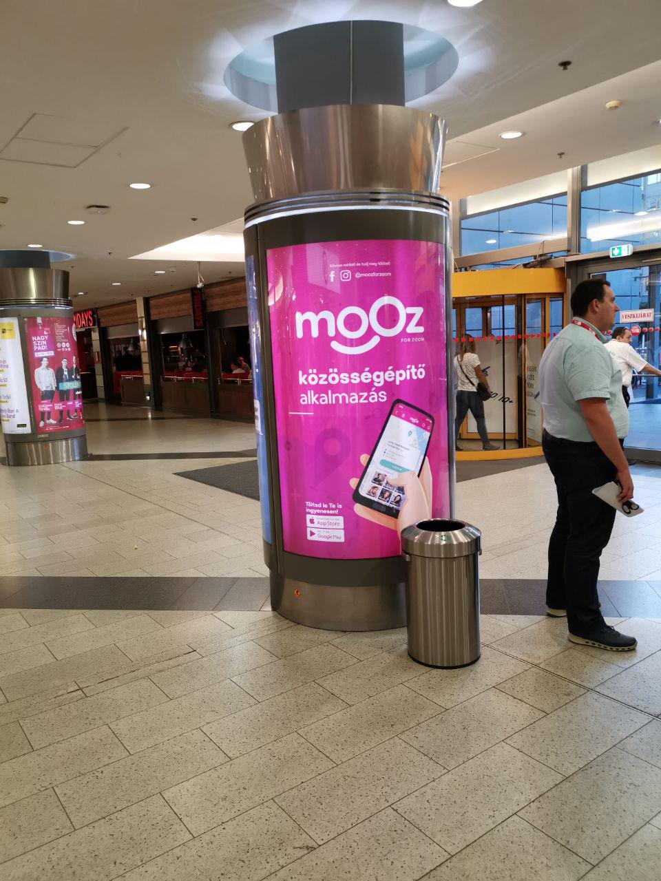
The first time I realised that Mooz had been released was when I was walking down to the underground, and I saw an advertisement about it. I felt so good that the app we had been working on for such a long time was finally released. I was so proud that I eveb took a few pictures of it.